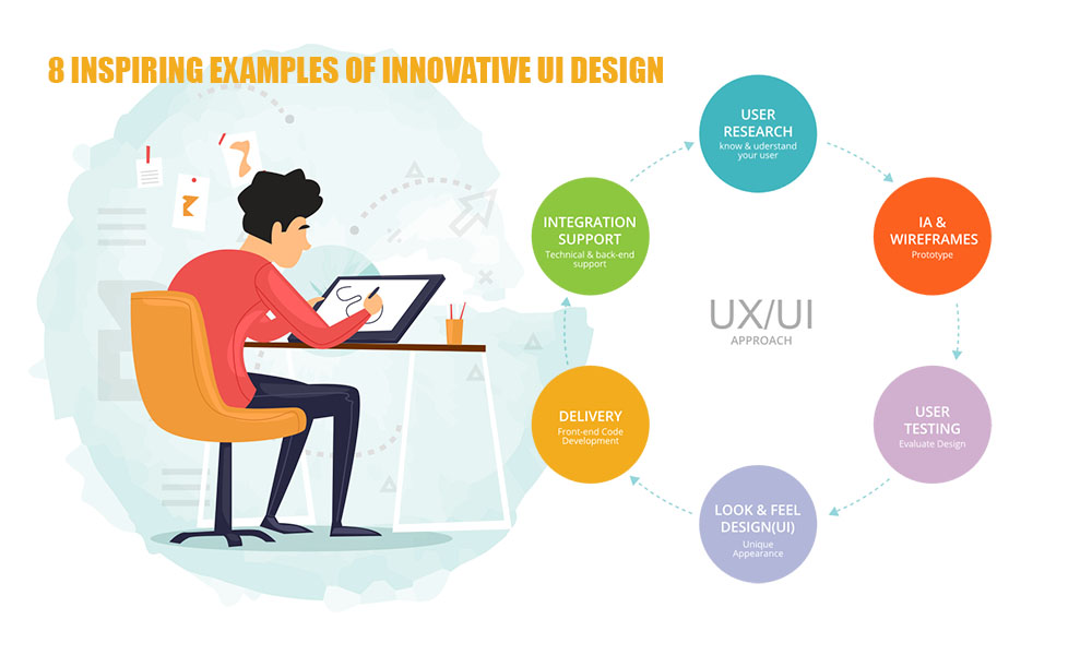
Introduction: The Impact of Excellent UI Design
The design of the User Interface (UI) goes beyond merely beautifying a website or application; it involves crafting an intuitive and smooth experience that captivates users. Great UI merges visual design, interactivity, and a focus on the user to address issues and generate joy. As technology advances at a breakneck pace, we are witnessing innovative and audacious UI strategies that defy convention and establish new benchmarks.
Below are 8 motivating instances of groundbreaking UI design that expand limits, enhance usability, and influence the evolution of digital experiences.
Apple – Where Minimalism and Functionality Converge
For a long time, Apple has been at the forefront of intuitive design, with its user interface across devices serving as an exemplary model of clean minimalism. Everything feels intentional, from the iPhone interface to macOS. Buttons are oversized, suitable for touch interaction, and well-marked. The user journey is enhanced by subtle yet purposeful animations that do not distract.
The most prominent feature is Apple’s commitment to accessibility: every interaction feels seamless, thanks to features like dark mode and haptic feedback. Apple’s ongoing influence on UI trends throughout the tech industry stems from this combination of aesthetics and utility.
2. Airbnb – Design that is personalized and focused on humans
The interface of Airbnb exemplifies a platform that comprehends its users perfectly. It emphasizes customized search filters, real-time pricing adjustments, and user-friendly calendars. The neat appearance serves a purpose beyond appearances: it is designed to facilitate decision-making.
The remarkable aspect is the interface’s distinctly human quality. With its approachable tone and lifestyle-oriented classifications such as “Design stays” and “Tiny homes,” Airbnb creates the impression for users that they are reserving experiences rather than merely accommodations. The interface has been customized and is intelligent and emotional.
3. Spotify – driven by data and dynamic
The user interface of Spotify is outstanding in its ability to adjust to user actions as they happen. By combining data-informed design with smart playlists, Spotify provides an unparalleled personalized music experience.
Its interface, which features a sleek design and dark theme, is designed for prolonged use. Elements such as “Made For You,” Discover Weekly, and dynamic album transitions enrich the user experience while keeping it manageable. The contextual playlists, organized by time of day or mood, showcase a clever and anticipatory design that seems nearly magical.
4. Duolingo – die richtige Umsetzung der Gamification
It’s not always easy to learn a new language, but Duolingo adds an element of fun with its bright and engaging user interface that turns the learning process into a game. Incorporating progress bars, badges, streaks, and levels gamifies the learning experience, making it something users are eager to return to daily.
The truly groundbreaking aspect is Duolingo’s use of real-time feedback. You immediately recognize the correctness of an answer, and the app provides hints through a user-friendly visual interface. Thanks to the cartoonish illustrations and character-driven journey, the interface feels vibrant and welcoming—even for complete novices.
Notion – UI that is modular and created by users
Notion is an exceptional platform that empowers users with control over the UI. It’s a tool that allows you to create your own dashboard, planner, or knowledge base using a modular block system. No matter if you need a to-do list, a database, or a journal, Notion allows you to create it precisely to your specifications.
The flexible space created by its drag-and-drop UI, markdown shortcuts, and real-time collaboration adapts to various workflows. Though it’s minimal, it possesses immense power—like a blank canvas that can conform to any use case.
Tesla – An Interface That Seems Ahead of Its Time
Tesla is not only innovating with vehicles but also redefining the in-car user interface. Just like the car, the interface displayed on a Tesla screen is remarkable. The UI, featuring real-time maps, autonomous driving status, and smooth animations, gives the impression of a sci-fi film come to life.
The brilliance of Tesla is in its design that takes context into account. The interface adapts according to the weather, location, or driving mode. The features are positioned as anticipated, and the visual hierarchy directs focus toward the most critical elements—such as speed, route, or battery status.
Headspace – Tranquil Interface for a Tranquil Mind
The meditation app Headspace has a design that perfectly aligns with its purpose. All aspects—color schemes, typography, animations, and so on—are designed to foster relaxation and clarity. The visuals, which are playful yet calm, alleviate anxiety and ensure the interface is approachable.
It employs uncomplicated language, amiable illustrations, and a gradual onboarding process, making it suitable for those who are not acquainted with meditation. The experience demonstrates emotional intelligence, showing that UI can affect our feelings as much as our navigation.
8. Google Maps – the supreme functional utility user interface
While Google Maps may not be aesthetically award-winning, its function-first interface is a UI marvel. Featuring real-time traffic updates, turn-by-turn navigation, street views, and restaurant information, it offers a vast array of tools organized within a clear and comprehensible design.
It’s incredible how Google Maps brings the right features to the forefront at just the right moment. In search of directions? The map adapts. Organizing a night out? Restaurant evaluations show up. Utilizing voice navigation? Visuals make simple. It’s intelligent, flexible, and essential for millions of users daily.
Conclusion: What Constitutes a Truly Innovative UI?
These eight examples revolve around a unifying theme: they address genuine issues through elegant solutions that prioritize the user. No matter if it’s Apple’s simplicity, Duolingo’s gamification, or Spotify’s personalization, every UI demonstrates a profound understanding of the user and a clever use of design principles.
UI innovation doesn’t always entail new technology or eye-catching visuals. It’s often the subtle, considered details that matter—a button positioned precisely where you need it, or a soft animation that indicates your next move. It concerns clarity, consistency, and creativity functioning together.
With the ongoing evolution of UI design, these examples serve as a reminder that the finest interfaces are not only used but also cherished.