The power of print is often underestimated in the digital age, but brochures are still one of the most effective marketing tools, particularly for companies that want to make a lasting impression in a tangible way. While eye-catching images and captivating copy are important, typography—the layout and arrangement of text—is sometimes disregarded.
Choosing a beautiful font is only one aspect of typography in brochure design. It involves developing a visual language that bolsters your argument, directs the reader’s gaze, improves readability, and arouses the appropriate feelings. When used effectively, typography may be the silent persuasive tool that helps you establish a stronger connection with your audience.
Let’s examine the importance of brochure typography and how to effectively use it to draw in readers.
First Impression: Tone is Set by Typography
One of the first things a prospective buyer will notice when they pick up your brochure is the typography, frequently before they even read a word. Fonts are like people. While a sophisticated serif font can imply tradition and sophistication, a strong, all-caps sans-serif font may signify strength and modernity.
For instance:
To convey elegance and tranquility, a high-end spa may utilize sophisticated, light serif typefaces.
To demonstrate creativity and simplicity, a software business can select simple, geometric sans-serif fonts.
Playful, rounded fonts could be used in a children’s learning center to appeal to both parents and children.
Important lesson: Align your typeface with the tone of your brand and the message you wish to convey. Your brochure’s unspoken tone is your typeface.
Use legible fonts: Steer clear of script or highly ornamental fonts for body text, as these are difficult to read in print, especially at
- Smaller Sizes: Readability: Making It Easy for the Eye Typography is important because it affects how easily your audience can read and comprehend your content. Even with excellent content, poor font choices or layout can drive people away.
- Keep the font size appropriate: Body text should typically be between 10 and 12 points. Bigger headlines are fine, but don’t exclude any crucial information. Allow space between lines (leading) so that your text may breathe. The reader may become overwhelmed with crammed lines. Clarity is improved by slightly increasing line spacing.
- Contrast: Make sure the background and text have adequate contrast. Although it may appear contemporary, light grey writing on a white background is difficult to read.
- Pro tip: Examine your brochure in print and in natural light. When a design is printed, it might not seem as good as it does on screen.
Hierarchy: Directing the Attention of the Reader
Typography involves more than just font selection;
it also involves structure. A well-designed brochure uses visual hierarchy to prioritize information and moves the viewer fluidly from one part to the next.
Guidelines for establishing a hierarchy:
Headings and Subheadings For headings, use bolder, larger fonts; for subheadings, use medium weight; and for body text, use regular weight.
Consistent types:
To keep the brochure looking neat and unified, use two to three font types throughout.
Color & Weight:
To draw attention to important messages or calls to action, use color or bold typography judiciously.
Whitespace:
Don’t be scared to leave spaces unoccupied. It helps highlight important details and provides a visual break.
Keep in mind that before reading a leaflet, readers scan it. The most crucial points are certain to be seen, even at a glance, thanks to a clear typographic hierarchy.
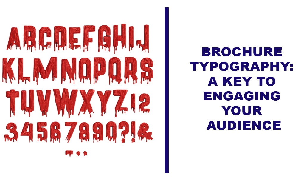
Emotional Impact: Typefaces Have a Greater Voice Than Words
It’s common to undervalue typography’s emotional impact. Even without a single image or graphic, the correct typeface can give your message a sense of friendliness, trustworthiness, boldness, fun, or luxury.
The perception of a brand is influenced by typography:
Using a hand-drawn typeface could give your company a handmade or artisanal feel.
A contemporary, simple font can convey efficiency and professionalism.
A vintage typeface might evoke feelings of authenticity and nostalgia.
Think about the audience’s desired emotional reaction while selecting your font. What feelings do you want them to have? Interested, thrilled, comforted, or in control?
Your emotional anchor is typography.
Branding: Trust Is Built Through Consistency
Your brand is reflected in your brochure. Your website, business cards, social media accounts, and packaging should all use fonts that complement your brand identity.
The importance of consistency
increases brand awareness
strengthens professionalism
produces a seamless client experience
Your brochure should use the same typeface or style guide as your brand. Follow the same family or pairing rules even if you employ different font sizes or weights.
Tip: Select font pairs carefully. A traditional pairing is a sans-serif for body text and a serif for headings, or vice versa. These fonts work well together and keep your design lively.
Call to Action: Converting Typography
Whether it’s to encourage a call, a visit to your website, or a purchase, every effective brochure has a purpose. Your Call to Action’s (CTA) typeface has a significant impact on conversion.
Make your call to action stand out:
Make use of bold typefaces.
Select hues that contrast with one another.
Give it lots of white space.
Place it in a strategic location, usually as a repeating element or close to the finish.
Strong call-to-action examples:
“Schedule Your Free Consultation Now.”
“Check Out Our Website for Additional Deals”
“Call Now to Receive 10% Off”
Make it big, easy to read, and emotionally engaging.
Print Issues: Useful Typography Advice
There are a few technical factors that influence your typographic choices because brochures are printed:
quality: To prevent pixelation, make sure your fonts are high quality and vector-based.
Bleed and margins: To prevent trimming problems, keep vital text away from the edges.
Colors in ink and screen: Always do a test print because colors may appear differently in print than on screen.
Additionally, confirm that commercial print use is permitted under your font licenses, particularly if you’re utilizing premium or bespoke fonts.
In conclusion,
The unsung hero of brochure design is typography.
Typography is a useful and emotive tool that influences how your audience engages with your content; it’s not merely an aesthetic decision. It can direct the reader, convey the essence of your brand, and motivate action.
Your brochure becomes more than just another piece of marketing collateral when you give typography the consideration it needs to become a compelling and captivating brand ambassador.
Therefore, keep in mind that typography is your silent storyteller and is more than just design the next time you create a brochure.