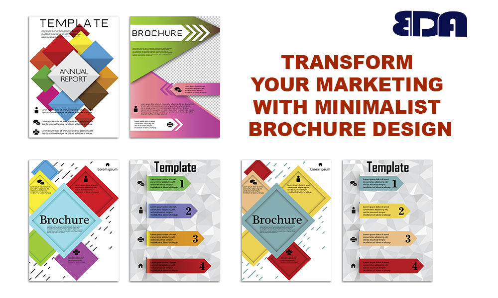
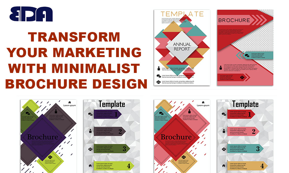
Overview of Simple Brochure Design
Let’s face it, everyone is inundated with information on marketing. Your message might easily be buried in the shuffle of wordy pamphlets and cluttered flyers. In this situation, minimalist brochure design is a welcome change. It conveys your point clearly, concisely, and without interruption.
The main goals of minimalist design are purpose, simplicity, and clarity. You cut out the extraneous details, leaving only the important ones. Imagine it as a clean, contemporary suit for your message—no extras, just communication that is impactful and sharp.
Minimalism is becoming more and more popular as firms compete for consumers’ attention in a sea of promotional materials. In addition to having a modern appearance, it respects the time of your audience by providing them with exactly the information they require. The outcome? increased professionalism, improved engagement, and greater branding.
The Benefits of Minimalism in Marketing
Have you ever been overwhelmed by the amount of text and images in a brochure? Yes, we do. Minimalism simplifies and magnifies your main point, which is precisely why it works like magic.
When you reduce:
By eliminating distractions, you help individuals concentrate.
Your design gets clearer and easier to understand.
Because you’re letting your content shine rather than trying too hard to impress, it gives off a premium vibe.
Audiences today are drawn to genuineness. And minimalism accomplishes that. Eliminating distractions encourages readers to engage with your content more deeply rather than merely skimming it.
You feel instantly more at ease, more concentrated, and more likely to stay for a while when you enter a clean space as opposed to one that is disorganized. That is precisely the goal you have in mind for your brochure.
Essential Components of a Minimalist Brochure
To create a minimalist brochure, you don’t need to be an expert in design, but you do need to understand the fundamentals. The following are the cornerstones of successful minimalist design:
White Space
This is your best friend, not a “wasted space” environment. White space naturally directs the reader’s eye and allows your text to breathe. It evokes a feeling of refinement and serenity.
Simple Typography
Make use of understandable, contemporary typefaces; consider sans-serif designs like Lato or Helvetica. Use no more than one or two typefaces, and experiment with weight and size to provide emphasis.
Restricted Color Scheme
Being minimalist does not imply being dull. Your brochure can stand out with a well chosen color scheme of two to three without overpowering the reader. Select colors that complement your brand, whether they are dramatic accents, pastels, or neutrals.
Useful Visuals
Don’t worry about too many stock photos. A dozen average images might be overshadowed by one powerful image per panel or section. Enhance, not overpower, with images.
Advantages of Minimalist Brochures
Top companies like Apple, Airbnb, and Muji employ minimalist design for a reason: it works. What a minimalist brochure offers is as follows:
- Clarity: Your message is very clear and concise.
- Professional Appeal: It has a high-end, refined, and deliberate vibe.
- Engagement: Your material is more likely to be read and retained by readers.
- Conversion: Action is more successfully prompted by targeted CTAs and messaging.
- Versatility: Print and digital media can both benefit from minimalist designs.
Creating a Simple Brochure: A Step-by-Step Guide
Now that you know how powerful minimalist design can be, let’s get started and learn how to make one yourself. Don’t worry, it’s not that difficult. It’s more important to approach each component intentionally.
Clearly state your message and objective
Ask yourself, “What is the main thing I want readers to know or do?” before you ever touch design tools. Clarity of purpose is essential whether you’re learning about your new service, scheduling an appointment, or browsing a website. This main objective should be the focus of the entire booklet.
Pick a Basic Design
Everything appears finished with layouts that have distinct divisions and alignment. In this case, a grid system is your best friend. Maintain a clean layout by using uniform margins and spacing. Use formats that organically divide your material, such as tri-fold or bi-fold.
Make sparing use of high-quality visuals
Visuals should support the idea in a minimalist brochure, not overpower it. Limit each page to one or two high-resolution photographs. Consider lifestyle photos, product close-ups, or iconography, depending on what best fits your brand.
Keep Your Text Brief and Intentional
More is less. Take out the fluff. Put the main advantages first, not the details. Make use of concise words, bullet points, and reader-guiding headlines. Additionally, remember to include a strong call to action.
Limit to two to three colors.
Visual harmony is produced by using a small color palette. Select one accent color, one dominant color, and perhaps a neutral. For example, use color to draw attention to headlines or calls to action.
Creating a minimalist brochure is similar to organizing a gallery of fine art. Only the best pieces are displayed, given room to shine, and visitors are guided through a purposeful experience.
Examples of Effective Minimalist Brochures in Real Life
Let’s use some instances to make this more relatable. These actual examples demonstrate how marketing initiatives may be revolutionized by minimalist design.
A Tech Startup Case Study
For a product launch, a new software business required a brochure. They went modest rather than the usual tech overkill of screenshots and statistics. One image per panel, bold black lettering, and a clean white background. Their call to action? “Start Your Free Trial” is the only one. The outcome? an increase in event sign-ups of 35%.
A Luxury Spa Case Study
A health company sought to advertise its recently launched spa packages. They employed delicate hues, sophisticated typefaces, and calm imagery—no fuss, just a sense of calm. With soothing images and sparse writing, each page concentrated on a single offer. The result? Bookings increased by 22%, and guests said that simply reading the brochure made them feel at ease.
Avoid these mistakes while designing minimalist brochures.
If you’re not cautious, even minimalism might backfire. The following are the main risks to avoid:
Making the message too simple
Yes, minimalism entails fewer material, but it doesn’t mean less significance. Don’t exclude important information that will help your readers decide. There should still be a purpose for each word and component.
Low Readability or Contrast
Although it may seem stylish, using light gray lettering on a white background is extremely difficult to see. Make sure your fonts and colors are readable and have adequate contrast.
Excessive White Space
White space is important, but there’s a limit to how minimalistic may be. Don’t let your brochure seem incomplete. Give each component space without making it feel alone; balance is key.
Insufficient Call to Action
Your CTA needs to be the focal point of a minimalist design. Make sure it’s compelling, obvious, and noticeable. To attract attention, use buttons, bold fonts, or color accents.
By avoiding these errors, your minimalist design stays purposeful and functional rather from appearing sloppy or lacking.
Print distribution response rates
- Inter-Channel Cooperation
Your brochure shouldn’t exist in a vacuum. Make sure it complements your email marketing, social media accounts, and website. For a consistent customer experience across platforms, use the same messaging and images. Minimalist brochures can transform from silent sales tools to lead-generating machines with the correct adjustments. Minimalist Brochures for Various Sectors
Numerous sectors benefit from minimalist design. Let’s examine how it adjusts: - Medical care
Patients are reassured by simple leaflets. Make use of clear information, soothing hues, and simple icons. Perfect for wellness brands, clinics, and hospitals. - Property
Emphasize upscale residences with tasteful photos and sparse content. Listings feel more upscale when white space is used to offer refinement. - Instruction
Minimalist brochures for training facilities, colleges, and universities assist distill course content and highlight the main advantages. - Hospitality
Minimalist designs are used in restaurants, hotels, and spas to convey elegance and tranquility. Consider brochures for rooms, service manuals, and spa menus.