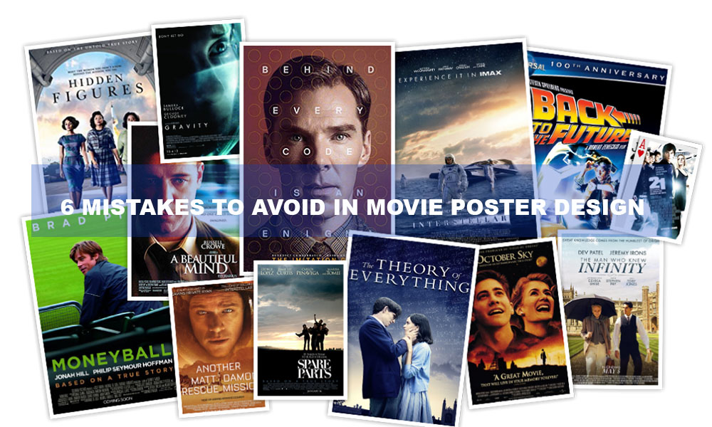
Creating a movie poster involves more than just adding a title and a few faces; it involves distilling the spirit of the film into a single, striking image. An effective poster can generate excitement, curiosity, and anticipation. However, if done incorrectly, it might mislead viewers or even alienate them completely. Let’s examine the top six movie poster design blunders and how to steer clear of them to produce artwork that effectively conveys the plot.
Why Film Posters Are More Important Than Ever
You would assume posters have become less important in the digital age, when social media teasers and trailers rule the roost. Not even close. Promotion still heavily relies on an eye-catching poster. It’s the content that appears on streaming services, is plastered on movie theater walls, goes viral as a meme, or endures eternally in a collector’s room. The poster serves as a visual representation of what the viewer might anticipate, and that is a serious duty.
Error #1: Disorganized Design Less is More
Overcrowding is one of the major mistakes when it comes to movie posters. Designers frequently attempt to incorporate too many elements—every slogan, logo, and character. The outcome? a disorganized chaos that overpowers the audience. Keep in mind that a poster must grab attention quickly. Your audience will browse or pass the movie if they don’t understand its plot right away.
White Space’s Power
Accept the enchantment of white space. It allows your material to breathe and makes important images stand out. Not only is minimalism fashionable, it’s also practical. A simpler layout draws attention to the important areas and gives the poster a more polished, contemporary appearance.
Error #2: Bad Typography Selections
Interest Is Killed by Illegible Fonts
Your silent storyteller is typography. You run the risk of destroying the entire composition if you choose the incorrect font. Even while fancy, highly stylized typefaces may seem cool, you’ve lost your audience if they can’t quickly read the title. Always prioritize legibility over flair.
Unreliable Font Styles
Confusion develops when different font styles are used without any visual coherence. An excellent general rule? For the title, tagline, and maybe fine print, use no more than two or three complementing fonts. Typographic consistency creates visual trust and unifies your design.
Third Error: Poor Visual Hierarchy
Directing the Eye of the Viewer
Every design should have a logical flow that leads the viewer’s eye from one place to the next. Your audience won’t know where to go first or, worse, won’t look at all if there isn’t a clear hierarchy. The audience should be guided naturally through the story by your title, main character, and significant visuals.
Setting Important Components First
Decide which components are most crucial and emphasize them. This could be the title of the film, the face of a well-known actor, or a striking visual scene. To draw attention to these elements, use location, color contrast, and size. Make sure nothing is vying for attention needlessly.
Error #4: Falsifying the genre or tone of the movie
Having the Incorrect Expectations
A poster for a romantic comedy that resembles a horror movie? That is an impending catastrophe. You may acquire clicks by misleading your readers, but you won’t gain their trust. Your design’s tone should be exactly in line with the topics and mood of the movie. If your movie is a suspenseful thriller, a gentle pastel color scheme won’t work.
The Value of Maintaining Genre Consistency
Audiences expect certain visual clues in each genre. Comedies frequently use vibrant colors and whimsical typography, horror employs shadows and tension, while sci-fi posters go toward futuristic aspects. Although you don’t have to follow trends mindlessly, being aware of genre standards facilitates rapid and clear communication.
Error #5: Poor Graphics and Pictures
Initial Impressions Matter
Pixelated photos or badly manipulated pictures are the epitome of amateurism. Since your poster is frequently the first thing a viewer sees of your film, it must exude professionalism. The way your video is viewed is greatly influenced by well-executed effects, well-composed visuals, and excellent photography.
Standards for Printing and Resolution
Make sure your poster is designed using high-resolution standards (300 DPI or greater) if you intend to print it. An otherwise excellent design can be ruined by hazy prints or color errors. To make sure everything looks crisp and deliberate, always preview your poster in the ultimate format it will be exhibited in, whether that be digital or print.
Error #6: Neglecting Credits and Branding
Important Details Are Missing
Movie posters are educational in addition to being works of art. The poster may seem lacking if important information is left out, such as the release date, website, social network handles, or even the director’s name. These minor details give audiences a sense of professionalism and make it easier for them to access more information.
Presenting Yourself Professionally Is Important
Not to be overlooked are the credits. Those small credits at the bottom, known as the “billing block,” may not look like much, but they are an essential part of movie poster design. It gives credibility and acknowledges the diligent individuals who labor behind the scenes. Regardless of whether you’re in Hollywood or independent, your poster needs to look the part.
In conclusion, creating a poster that effectively conveys the narrative
A movie poster is ultimately an invitation rather than merely a promotional tool. By avoiding these six typical blunders, you may produce a visual masterpiece that captivates viewers, tells an engaging tale, and enhances the branding of your movie for years to come. Maintain a neat layout, clever typography, story-aligned images, and a polished presentation. If you get that right, your poster will fascinate an audience in addition to adorning a wall.