Introduction: The Importance of Responsive Design
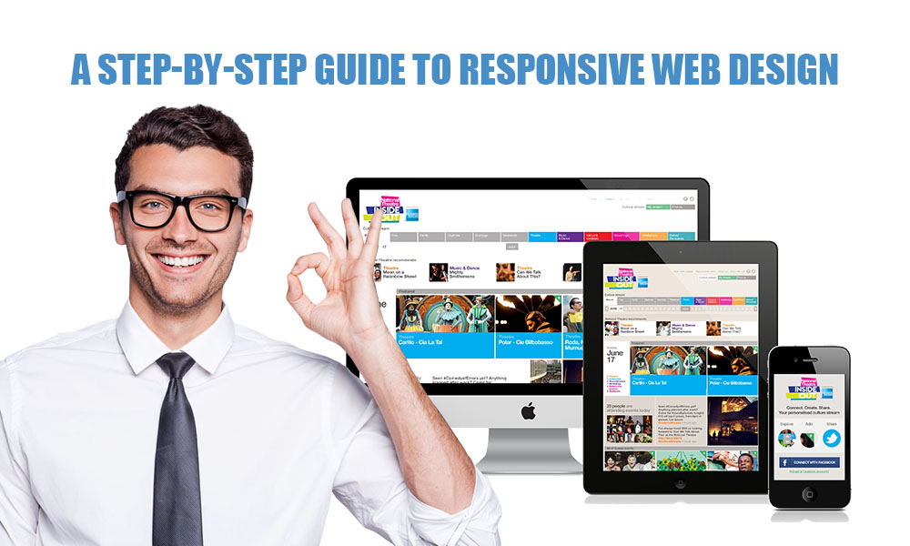
Picture this: you visit a site on your mobile device, and the text is so small it’s hard to read, images are cropped, and you need to zoom in just to be able to press a button. It’s frustrating, isn’t it? That’s where responsive web design comes into play. It guarantees that websites appear and operate effectively on all devices—desktop, tablet, or smartphone—without the need to create multiple site versions.
And here’s the positive aspect: creating a responsive website doesn’t require coding skills. Thanks to contemporary resources and platforms, it can be done by anyone. No matter if you own a small business, are a blogger, or work in digital marketing, grasping the tenets of responsive design will aid you in creating a more effective online presence.
Step 1: Opt for a Responsive Website Builder
The first step is to choose the appropriate platform that takes care of responsive design automatically. Well-known website builders such as:
Wix Squarespace Shopify
Responsive themes for WordPress
Are all provided with templates that respond to mobile devices. You can drag and drop elements on these platforms, and they will automatically adjust to various screen sizes.
Tip: Prior to selecting a template, check its preview on desktop, tablet, and mobile views. This preview mode is permitted by most platforms.
Step 2: Choose a Template That Works on Mobile
Your site’s appearance and ambiance are built on a solid template. Ensure that the template is tagged as “responsive” or “mobile-friendly.” These templates are pre-designed to adjust content and layout for various devices.
The following are the features to seek out in a responsive template
- Simple and clean layouts (as complex designs often break on small screens)
- Text areas and image blocks that can be adjusted
- Menus that condense into icons (such as the hamburger menu)
- Fonts that are appropriately scaled for small screens
Step 3: Develop a layout with mobile users as the priority
Focusing on mobile design initially helps you concentrate on the essentials. This is how to create a mobile-first design without coding:
Prioritize your content: Consider what your users need to see first. Position your key messages, contact information, and call-to-action buttons at the top.
Utilize vertical scrolling: Since individuals instinctively scroll on their mobile devices, arrange your website to progress vertically instead of attempting to fit in side-by-side columns.
Avoid clutter: Maintain a minimalistic approach. An excess of images, animations, or pop-ups can negatively impact mobile performance.
A lot of builders let you personalize layouts for various devices. Utilize this to adjust your mobile version without altering the desktop layout.
Step 4: Enhance Images and Videos
If media files are not optimized, they can have a serious effect on your website’s performance. Fortunately, this can be accomplished without any design or coding expertise:
Utilize image compression tools such as TinyPNG or CompressJPEG prior to uploading.
Select formats such as JPEG or WebP for improved compression and quicker loading times.
Utilize only essential videos and embed them from platforms such as YouTube or Vimeo to improve responsiveness.
Ensure that your media fits the screen without overflowing or necessitating horizontal scrolling.
The majority of builders resize images for mobile automatically, but it’s important to verify everything in preview mode to make sure the media appears excellent on all devices.
Step 5: Make Navigation Easier
If done poorly, navigation is one of the biggest challenges on mobile. Here’s how to make it easier without using any code:
- Utilize a hamburger menu: The three-line symbol has become the norm for mobile navigation.
- Limit the items in the top-level menu: Retain only essential pages such as Home, About, Services, and Contact.
- Link buttons in a clear manner: They should be of sufficient size for a finger to tap, rather than a mouse.
- Steer clear of dropdowns: They can be difficult to use on mobile. Use uncomplicated navigation that is friendly for touch
Typically, your website builder offers navigation settings that allow you to customize menus for mobile, tablet, and desktop devices individually.
Step 6: Preview and Test on Actual Devices
You have constructed your website. Test it now. Although website builders offer device preview modes, nothing compares to testing on actual devices. Here’s what you should verify:
Is the site fast-loading?
Are you able to read the text without zooming in?
Do all buttons and links function properly and are they easy to tap?
Are the images and videos of good quality?
Is the navigation easy to understand and practical?
Test across a wide range of devices and browsers: iPhones, Androids, tablets, and laptops. Request that friends or coworkers look through your website and share their impressions.
Step 7: Utilize Integrated SEO and Performance Tools
The majority of platforms include integrated tools to enhance your site’s speed and visibility:
Mobile performance metrics: Website creators such as Wix and Squarespace evaluate your site speed and provide suggestions for enhancing mobile loading times.
SEO settings: Utilize SEO features to enhance your titles, meta descriptions, and image alt tags.
Caching and lazy loading: These features enhance speed by loading only what the user can see.
These tools provide guidance to help your site operate smoothly and achieve a good ranking, even if you lack technical expertise.
Step 8: Regular Updates and Consistency Are Key
After your responsive website goes live, your work isn’t finished. Keep it updated regularly to ensure freshness and smooth operation.
If you are using a third-party theme, check for updates to the template.
Examine the analytics to understand how users engage with your site across various devices.
Repair broken links or refresh outdated content that could negatively impact the user experience.
For a cohesive experience, make sure to use the same fonts, colors, and button styles on all devices—consistency is crucial.
Conclusion
Responsive web design has become essential, rather than a choice. The positive aspect? Creating a mobile-friendly site doesn’t require you to be a developer. Using intuitive tools, ready-made templates, and straightforward strategies, anyone can create a responsive website that looks good on all devices.
Adhere to this guide with sequential instructions, ensure your site is exhaustively tested, and consistently consider your users. Visitors will remain longer and are more likely to return if you create a better experience.


