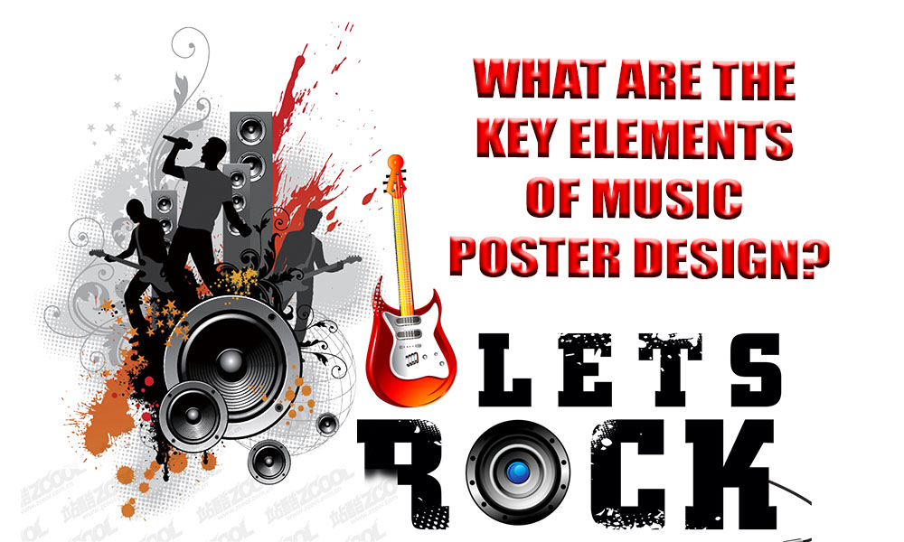
Introduction to Music Poster Design
Music is by its very nature a visual medium. Visuals, from stage designs to album covers, are essential to our perception and interaction with sound. In particular, posters are among the oldest and most successful methods of promoting music. In addition to drawing attention, a well-designed poster conveys information about the artist, the occasion, and the experience that will be had. It must maintain the spirit of the music while combining clear information with visual attractiveness.
Let’s explore the key components that make a great music poster.
Visually Appealing Typography
The first thing that most people notice about a poster is the typography. It must be audacious, imaginative, and readable from a distance. Elegant scripts for jazz evenings, sleek sans-serifs for electronic music, or gritty grunge typefaces for punk rock performances can all help to identify the event’s personality.
Font pairing is an art form in and of itself. While the body of the text adheres to a more readable and clean typeface, the headline may employ a dramatic display font. Important details like the artist’s name and the date should be prominently shown, preferably in the center or close to the top. Everything is kept balanced and palatable with the aid of alignment and space.
Essentially, typography transmits tone, genre, and energy in addition to words.
Vibrant Color Schemes That Are Relevant
Color sets the mood and is more than just adornment. A person can quickly determine the type of music event they are looking at by using the appropriate color scheme. Dark, melancholy colors like black, crimson, and gray could be used on a metal concert poster. A festival of reggae? Warm, vivid colors like red, green, and yellow are to be expected. Every genre has its own color language.
Beyond aesthetics, however, color selections must guarantee legibility. It’s important that the text and background contrast. Even though you may adore the neon-on-neon aesthetic, a poster is ineffective if people cannot immediately see the content.
Color psychology is frequently used by designers to improve emotional response. Color is your silent, potent communicator; use cool blues for laid-back vibes and flaming reds for fierce vigor.
Graphics and Images
A music poster’s images should reflect the essence of the song. This might be a digital illustration that fits with the show’s concept, an abstract design that reflects the record artwork, or a picture of the band performing live.
Originality is important. Custom artwork or styled visuals tend to stick out more than stock images, which can come across as generic. While some posters use subtle iconography and negative space, others go all out with graffiti or psychedelic patterns.
Additionally, keep the genre in mind at all times. For example, EDM events may utilize futuristic, glow-heavy images, indie rock may go for artful collages, and hip-hop posters may favor urban imagery.
Information Hierarchy
Let’s be realistic. Information is obtained by looking at a poster. They won’t come if they can’t tell who is performing, when it’s happening, or where the venue is.
An effective music poster adheres to a hierarchy. The most crucial information should be displayed first, such as the artist’s name, the date, and the location. Supporting information can be smaller but still readable, such as ticket costs, sponsors, or opening performers.
Make use of the font’s weight and size to direct the viewer’s gaze. Perhaps the venue is below, the date is a little smaller, and the name of the main act is enormous. To prevent clutter, arrange information in blocks or grids. In this regard, visual rhythm is crucial; it should be instinctive and simple to quickly scan.
Consistency and Branding
Branding is important for both independent musicians and major festivals. The identity of the musician or event being promoted should be reflected on the poster. This covers color palettes, logos, and overall tone.
Does the event have an established logo or typeface? Make use of it. Do you have a series of posters in the works? To make them easily recognized, even from a distance, keep them all consistent.
Recognition is developed by repetition. You’ve done something good if your poster’s visual tone is enough for fans to recognize it from across the street.
Layout and Composition
The placement of a poster is equally as important to its design as the content. The way you arrange all the components—from text and pictures to logos and background effects—is known as composition. A well-designed layout directs the viewer’s eye from the most crucial element to the least, or from top to bottom.
A design can achieve tension and equilibrium by applying the rule of thirds. White space, often known as negative space, allows important components to breathe and keeps the poster from feeling packed. Proper alignment of text and photos makes the poster look polished rather than cluttered and aids in reading.
Here, hierarchy is involved once more. Consider your layout as a journey, with a bold headline at the beginning, images at the middle, and details at the end. Regardless of their artistic merits, posters that appear disorganized quickly lose their appeal. Interest and trust are fostered by structure.
Considerations for Printing and Display
If not printed properly, even the most beautiful digital poster might look flat. For handouts, a tiny flyer might be sufficient, but wall posters need to be big enough to be viewed from a distance. A2, A3, and even larger formats are common poster sizes, depending on the location of exhibition.
Another important component is resolution. For print, always design at a high resolution (300 DPI or higher) to prevent pixelated or blurry images. To avoid crucial content being trimmed out during trimming, take into account bleed areas.
Additionally, don’t ignore the supplies. While glossy treatments add vibrant color, matte paper creates a sleek, contemporary appearance. Weather-resistant materials could be a wise choice if the poster will be displayed outside. Additionally, consider its placement: will it be exhibited at a location, pinned on a café wall, or posted on a street pole? Make your design as visible as possible in its surroundings.
Conclusion
Designing music posters is an art form that blends communication, strategy, and creativity. Being able to connect with an audience, convey a story, and evoke strong emotions before they even hear a note is more important than simply looking good. The most effective posters capture interest, convey information rapidly, and make an impression.
Every detail counts, from layout and print quality to font and color. These essential components serve as the cornerstone of an effective, memorable poster, regardless of whether you’re creating it for a small band or a large music festival. If you get them right, people will remember your poster in addition to seeing it.