Introducing the Design of Minimalist Posters
Despite having its origins in art and architecture, minimalism in design gained popularity in graphic design for good reason. A minimalist poster seeks to communicate a message as elegantly and plainly as possible while avoiding distractions and clutter. This method focuses on intentionality rather than absence.
Minimalism is a potent tool when applied to poster design. With minimal noise, it makes your message stand out, directs the viewer’s attention, and frequently creates a lasting impact. Minimalist posters, whether for a company, event, or product, may convey a lot without saying much.
The Key Is Simplicity
Simplicity is at the core of minimalist poster design. Every component should have a function; otherwise, it disappears. This idea compels you to cut out the extraneous details and focus on the main points of your message.
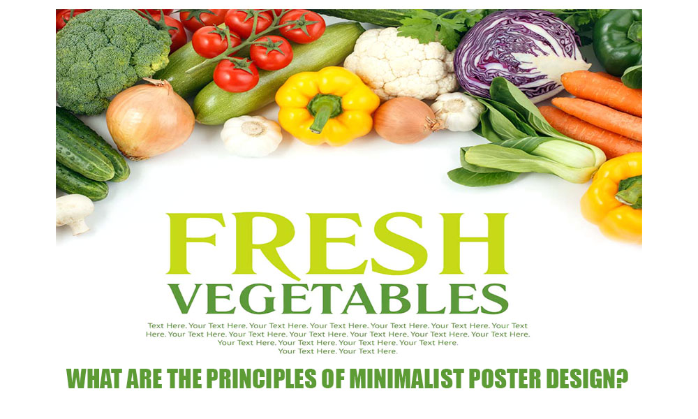
A minimalist design might only have one image and one line of text on a poster rather than cramming it full of images, fonts, and slogans. This “less is more” strategy makes sure that your audience doesn’t feel overloaded and can quickly understand the main points of what you’re saying.
Consider Apple advertisements, which feature a single product at the forefront against crisp, white backdrops. Its focus makes it effective. And that’s the whole idea.
Negative Space is Stressed
White space, often known as negative space, is purposeful rather than merely vacant. Negative space in minimalist poster design provides a resting area for the eyes and highlights the significance of the content.
Designers provide visual breathing room by leaving space between text and images. This enhances the content’s readability while also making it easier to digest and more aesthetically pleasing. Your key point is more emphasized when it is surrounded by space.
Additionally, negative space promotes a feeling of harmony and order. It keeps your poster from appearing disorganized and makes the whole thing more soothing and interesting.
Employing a Restricted Color Scheme
In minimalist posters, color is frequently subdued, regulated, and purposeful. Monochrome palettes or two to three complementary colors that bolster the atmosphere and message are more common than a rainbow of hues.
This method improves the design’s clarity while also making the visual experience simpler. The primary message or image can really shine when there are fewer colors vying for the viewer’s attention.
Furthermore, minimalist color palettes frequently capitalize on the psychological impacts of color. Bold reds convey vitality or urgency, whereas gentle blues convey serenity. When used effectively, sparse color can evoke strong feelings.
Clear and Intentional Fonts
In minimalist poster design, fonts are not only picked; they are carefully chosen. Typography turns as a stand-alone design element. Modern, clean typefaces like Gotham, Futura, or Helvetica are popular, but simplicity and readability are crucial.
Typography must be readable at a glance in addition to being aesthetically pleasing. No matter how creative your layout is, it is a failure if people must squint or guess what it says.
Additionally, hierarchy is crucial. The body text, subtitles, and titles should all have varying weights or sizes to naturally direct the viewer’s attention from the most to the least important. Text alignment and arrangement are frequently used in minimalist posters to establish visual rhythm without the use of extraneous decorations.
Intentional Layout and Composition
Structure is a key component of minimalist posters. A strong composition guarantees that the design feels finished even with fewer components. Designers can produce symmetry, balance, and order by utilizing grid systems and alignment tools.
Again, hierarchy is important; viewers should know right away where to look first, second, and third. This entails putting the most crucial components—such as the name of the event or the product—in prominent locations and emphasizing them with contrast or size.
A minimalist poster should make everything feel appropriate rather than haphazard. Something doesn’t belong if it doesn’t enhance the aesthetic or message.
Use of Icons and Images Strategically
The use of imagery in minimalist poster design is limited but purposeful. Designers choose clean, simple images—typically silhouettes, symbols, or abstract graphics—instead than busy or excessively detailed imagery. This method gives the viewer visual interest without becoming overpowering.
In this situation, icons can be particularly effective. A well-chosen icon can effectively convey a message even when it takes the place of entire lines of words. For example, a brief explanation of a music event may never be as effective as a simple headphone icon.
Minimalist posters frequently utilize monochrome images or imagery that complements the restricted color scheme. Enhancing rather than detracting from the message is the aim. The image should reinforce the main idea of the poster, whether it is a simple photograph, a line illustration, or a geometric design.
Brand Alignment and Consistency
Identity is not sacrificed in the name of minimalism. Actually, keeping a strong brand presence without utilizing a lot of visual elements is one of the fundamental problems of minimalist design. This entails selecting layouts, colors, and typefaces that complement the tone of the event or brand.
For instance, to fit the mood of a jazz concert, a minimalist billboard would utilize muted color schemes and traditional serif fonts. For a contemporary look, a tech business can choose strong sans-serif fonts and a striking color scheme.
It’s also critical to maintain consistency across various media and platforms. Your poster should blend well with your website, social media visuals, or promotional flyers if it is a part of a campaign. This consistency is ideal for minimalism since it fosters visual harmony and trust.
Clarity and Functionality
Function is the primary focus of minimalist poster design. The poster’s message should be conveyed succinctly and clearly. The audience should be able to quickly ascertain the who, what, when, and where if it is promoting an event.
By focusing on functionality, gimmicks and superfluous effects are avoided. Each component should be picked for its functionality as well as its appearance. Does it aid in the narrative? Does it improve the message’s readability?
This is achieved through clean layouts, accessible typography, and a clear hierarchy. They guarantee that your audience not only notices but also comprehends your poster.
Flexibility in Print and Digital
When it comes to various forms, minimalist designs are quite adaptable. They grow nicely from tiny business cards to enormous billboards without losing impact since they depend on fewer components. A minimalist poster’s simplicity and clarity make it ideal for digital sharing on websites or social media.
Nevertheless, designers must take into account particular distinctions between digital and print consumption. Text size may need to be adjusted based on viewing distance, and color modes vary (CMYK for print, RGB for digital). The best designs for preserving sharpness across formats are simple, vector-based ones.
Minimalism guarantees quicker load times, simpler printing, and improved readability in both situations. It benefits contemporary design requirements.
In conclusion
More than just a fad, minimalist poster design is a philosophy that values intentionality, clarity, and purpose. When done correctly, it produces a poster that is sophisticated, powerful, and unforgettable. You can create posters that are not only aesthetically pleasing but also effectively communicate by emphasizing simplicity, clear font, thoughtful use of color and space, and a compelling message.
By adhering to these guidelines, you can produce minimalist posters that have a profound impact on your audience, whether you’re designing for an event, product, art exhibition, or brand launch. There are instances when talking less really does say more.